
If you glance at these charts, you might quickly take away the insight that Average Revenue per User (ARPU) is fairly consistent across all regions. That’s pretty interesting.
However, you would be wrong — very wrong.
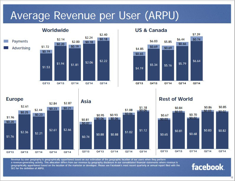
I’m not suggesting Facebook was trying to be misleading. But for a company whose business revolves around data, this is certainly a disappointing showing. The analyst likely created each chart individually, allowing the scale to be maximum height, then combined them as you see here.
If you look at the actual figures, then you can begin to form a better picture of what’s happening. But, it’s a lot of work to compare performance across the regions and see a clear story.
Check out the entire earnings slides. You will see this same mistake over and over.
Facebook, please hire my company and we will help you make better investor presentations.
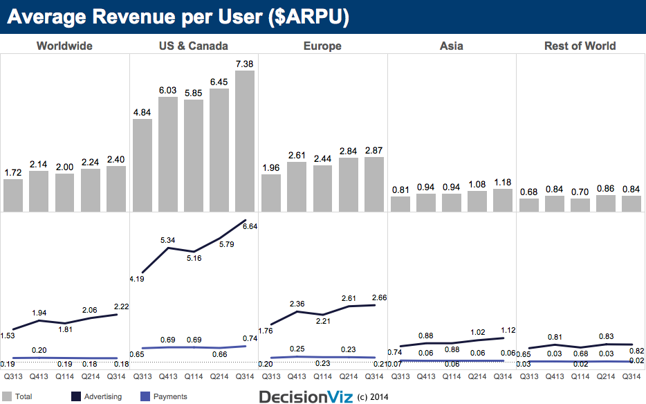
Here’s one starter idea that makes it easy to see the total and the trends…
Happy to hear your comments…
Check out this Andy James track for some guitar distortion — only brilliance here.


Gabriel, yes, you can create this type of chart using Excel, or better an add-on called Chart-me (www.hi-chart.com)
The bottom line chart might yield even more interesting findings if both measures were worked into a single % measure, given how small payments are as a % of advertising.
Yes, I was thinking about using percentages and felt it might be confusing since these are average measures versus actuals.
Lee,
A great chart, did you use Excel or any other software to create it – would like to learn how to make one as well.
Thanks in advance!
Thank you. I easily created this visualization with Tableau Software. Let me know if you would like to learn more …
Extraordinary. One of my 2014 clients demanded usage of stacked bars in this exact manner. Despite my making a similar best practice visualization recommendation in three separate meetings to a novice, “the client is always right” rule mandated I yield to their judgment.
Yes, these are the kinds of challenges to be faced around best practices. Have courage to not argue over the visual, but to understand the reasons behind the client’s opinion or needs. Often they will begin to better understand the best practices your have proposed and you may find some middle ground.
Nice make over – I like the marks on separate rows.
Nice finding Lee, clear, strong impact, I love it.